Fresh New Look
Here you are on our website! Notice anything different?
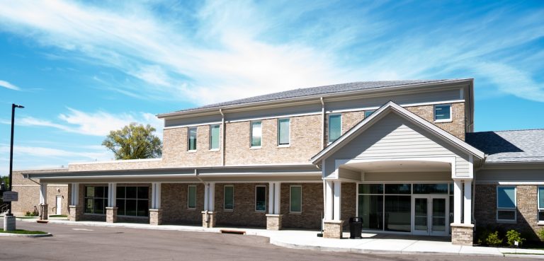
It has been refreshed, making it a cleaner, clearer site that is easier to navigate, utilizing bright new colors taken directly from the walls and murals of our modern building.
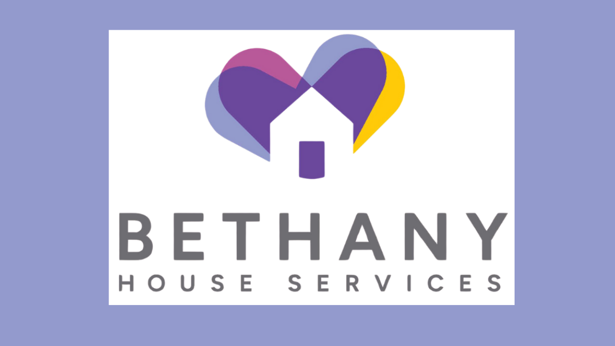
Our logo has likewise been refreshed. The heart and home are still central to all we do, but we’ve introduced some new colors. Keeping purple as our primary color, we have added green for growth, blue for tranquility, and orange for vibrancy. These colors represent our clients and the transformations that occur within our walls.
Jackie Schaiper, longtime supporter of Bethany House, refreshed the branding. Hannah Carver refreshed the website. Many thanks to both of them.
